1. Front Cover
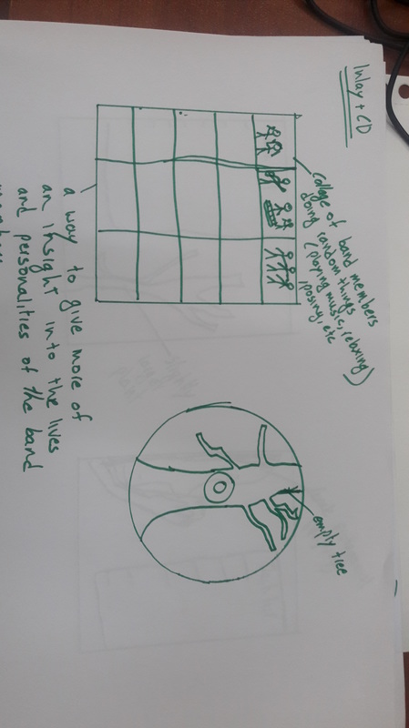
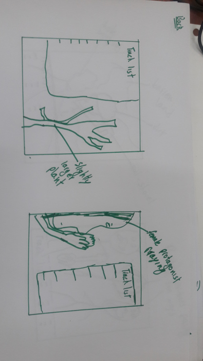
So after discussing the production journey of our ancillary task of a Digipak here is the final Digipak:
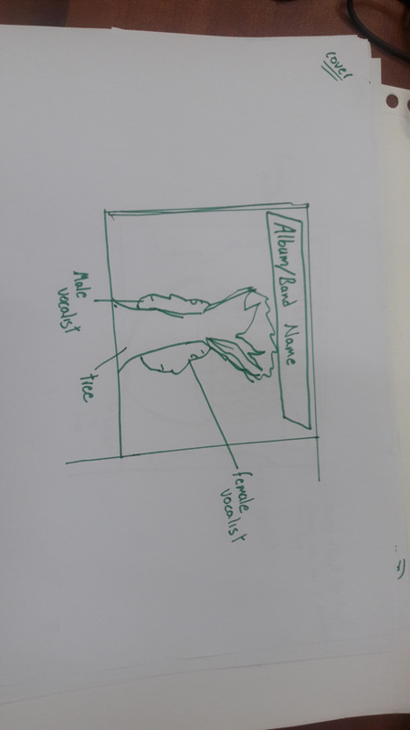
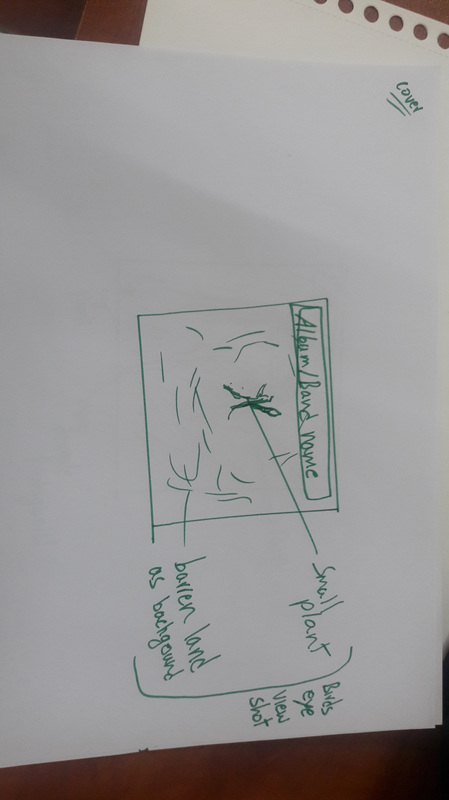
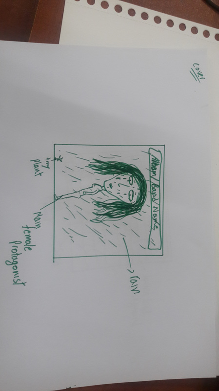
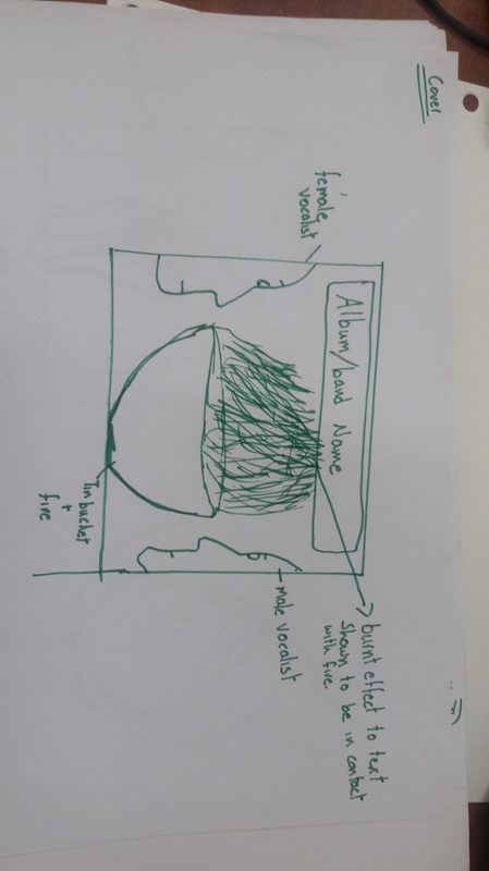
 1. Front Cover 2. Back Cover 3. Cd Cover 4. Inlay And this is how they look when put together in a Collage: Post done by Humble Awan.
0 Comments
The Inlay was also created in Adobe Photoshop and we decided to have a collage of pictures from the behind the scenes and the photo shoot and the narrative shoot, something to interest the buyer and interact with the whole production phase. A border was added to make the pictures more prominent and layers were placed on each other to give a more creative effect. Created by Fatima Ali.
The Cd cover or sticker will also follow the same background as the front and back covers. I used the same picture and masked it by creating an ellipse of 4.5 inches radius which would be the standard Cd size. Then I masked the background into the the ellipse and picked and dropped the color of the Band name which was in a red shade. Then i created an Ellipse within the Cd Ellipse on which i selected the path and wrote the song names on that ellipse. Then I added the Compact disc logo and Dolby surround logo as well and our Recording label logo as well which was "Walnut studios" and i also added another ellipse on the inner circle to give it a more prominent look and black outline as well. Below are the evidence of the masks and the layers I created throughout the Cd cover production. Here is the Final Cd cover. Created and Done by Humble Awan (Me)
For the back cover of the Digipak I used the same background as the one on the front cover, this would help to create a link and follow the same theme that the digipak is following. then i added the same band name logo and the album name as well, I also added a rectangular ellipse to mark a boundary of the back cover and also the record label which was "Walnut studios". The back cover finally started to have its shape as i rearranged and placed these items to find out where they fit best. Then I also added the song listing which was aligned on the left side under the album name. I tried different placements such as in the center but at the end placing the song listing on the left side seemed more appropriate. Finally The group also came up with the idea of adding tags such as that of online social networks including Facebook, Twitter, YouTube and others, so we added those as well to give it a more diverse look, and to show that the band can be followed on these networks as well which would create more audience following and a band image. Finally the Final back cover was prepared after adding all these and aligning them in their places, which is shown below. Digipak Created and Post done by Humble Awan (Me)
So in this post I will talk about the production process in Adobe Photoshop of the digipak front cover. I started off with choosing the background picture which was of the barren land and the cracks in the ground since it depicted our narrative and I wanted to make a link with the performance. Then I added the band logo which was created by tracing in Photoshop and the color was chosen in a lighter shade of red and Opacity was reduced. Then to make the background more colorful and pleasing to the eye, i used the gradient overlay and adjusted it in brown to give it a more earthy feel and make the details of the earth more visible. Then I used the Lasso tool to crop out the faces of the 3 performers and by using the eraser tool and masking their faces using the magnetic lasso tool and giving them a proper face outline, I moved the faces to find the best position and then decided on positioning their side poses on the left side then I used the blending options and the darken color tool to make their faces blend in the background giving a more artistic look. The final Digipak front cover is below. Front cover created and post done by Humble Awan. (Me)
Bands have their own recognition symbols and have their logos designed in a specific manner so that audiences are able to recognize immediately what artist or band they are listening to. For our band "Awaaz" we decided to make the logo using calligraphic reference from the Newspaper: Awaaz. Using Photoshop to create the logo, we used the pen tool to trace it out. Since our logo will be in Urdu it gives a traditional look allowing more audiences to be able to relate to it. To make it easier for all sorts of audiences to understand we will have "The Voice" written underneath the logo. The image above shows the process to create the logo, we used the pen tool to trace the letters, we added different colors to each part of the letter to make the process visible and easier to understand at first. The final logo with "The voice" written underneath is also shown to make it understandable for all audiences.
Having our own logo gives the band their own recognition for people to be able to recognize them instantly developing the star image of the band, making band promotions and marketing easier. Done by Fatima Ali After preparing the sketches and getting the ideas about the Digipak from our group member Faisal, I went out and did the photo shoot for the Cd which we chose would have a plant on it with barren soil behind it where the depth of field will be applied. and i will add the burnt effect and also add more color to the background as well in Photoshop. For our main Cd cover we were planning to Keep a shot of the whole band, or create a picture in Photoshop which will basically be a Tree in the center and the side poses of the vocalists on either sides of the tree trunk. on the Inlay we will have a collage of pictures such as the one above and of another members, candid pictures and behind the scene pictures as well. so a lot of pictures in a unsymmetrical collage will be on the inlay of the CD cover.
Post done by Humble Awan (Me) Here are some of the sketches of the DIgipak. For the Cd/Inlay For the back. Sketches Done by Faisal Yazdani.
The Front Cover of the album Cd "Appetite for destruction" of the rock band Guns n Roses is quite simple with a black background.
The band name is written at the top of a figure of the crucifix on which a skeleton figure of the faces of the 5 members of the band are present and the album name is below the crucifix. The skeletons and crucifix are a representation of danger and aggression and religion as well since the band are not anti Christianity therefore the crucifix is not upside down. but the main representation is to show that they are a hardcore, non stop, high voltage rock band. The Back cover of the digipak contains a picture of the band posing, the representation is like the conventional representation of rock stars with the long hair and tattoos and a rough look. The back cover has the song listing on one side of the back with the cast and production credits as well, a bar code is also present and a note about the quality of the Cd is also present. The logo of the record company is also present which would be as a demand for the record label to have some advertisement of there's as well. The Inlay of the digipak includes a collage of the performance shots of the band at different sets locations and concerts. The Cd includes the song listing on its right side and a credit to the record company on the left side with the logo present on the Cd as well. The Band name and the album name are at the top in a larger font to show more importance of the 2 names. The Front Cover of the album Long road out of Eden by Eagles is a plain and simple cover.
Conventionally the Band name is at the top and is the largest in size, the band name of eagles is usually written in Block capital letters as is also the case in the front cover of this album. the album name is written under the Band name and most of the emphasize is on the band name which is a way of branding the band and also since Eagles is a well recognized band so that creates more sell points. The Establishing shot of the mountains and deserted area with a road in center depict the album which is "Long road out of Eden" The Back Cover of the album also follows the same theme of a deserted, mountainous area with the picture of the band under the song listing, comparatively the focus of the Cd cover is towards the album and not the band which is quite unconventional as only a small picture is shown, that too on the back, this shows that the band is well recognized and they do no need to show their faces in order for the audiences to recognize them because they have a strong following and audience who recognize them from their band name. The spine is also present which contains the Cd volume and the name of the band and album. Inlay and the Cd of the digipak are quite simple, the inlay including the picture of the band walking on the same deserted area as the album features where as the Cd includes the band name and album name as well as the music production companies name which is written in a really small font across the circumference of the cd. |
AuthorHey! I Am Humble Awan, an A'level media studies student at Learning Alliance. Archives
May 2016
Categories
All
|